
…. and a data puzzle
The economic news right now is filled with talk of inflation, energy price hikes and shortages. There is even a mini strike wave. “Striketober” is a thing!
References to the 1970s are everywhere. Stagflation – the combination of low growth and inflation characteristics of the 1970s -has become one of the most searched terms on news terminals.
Personally, I invoke crises a lot. In my new book, Shutdown, “polycrisis” is a key term. But I’m skeptical about this current crisis discourse. Perhaps it is an effect of having recently taught Michał Kalecki’s classic 1943 essay on the manipulative politics of confidence discourse. As Kalecki explains, in economic policy debate, talk of confidence is not innocent. It is a way for business leaders and their spokespeople to set the agenda in economic policy. Who after all is to judge whether business has lost confidence or not. Crisis talk is often the flip side of “confidence” talk. And in the current moment talk of inflation linked to talk of an energy crisis is being wielded against at least two progressive agendas: the Biden infrastructure push and the global push for net zero. It will no doubt soon rear its head in Eurozone fiscal policy debate as well.
I’m going to be coming back to this issue in future newsletters. It is at the heart of a new piece forthcoming in the New Statesman.
I want to focus in today’s newsletter on a particularly urgent issue: food prices
Generally, when we think about the 1970s and early 1980s we think about OPEC, lines at petrol stations, inflation and labour unrest in the US and Europe. Perhaps we might think of the tensions in Eastern Europe that culminated in the declaration of martial law in Poland in 1981. Or, the beginning of the era of Latin American debt crisis.
But from a global point of view, one of the most severe symptoms of crisis in the early 1970s was the spike in food prices, coinciding with starvation and famine conditions in some of the poorest countries in the world.

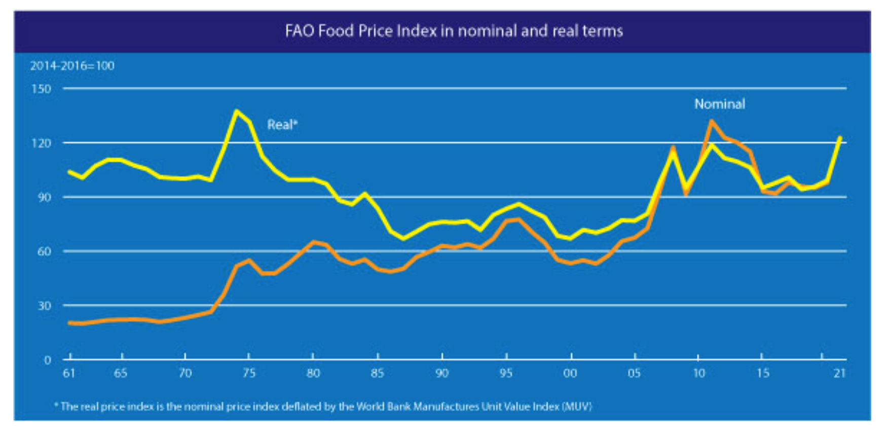
Source: FAO
Over the following decades, from their peaks in the early 1970s, world food prices fell by almost 50 percent in real terms. They did not begin to rise again sharply until the early 2000s, reaching a new peak in 2008 and then again in 2011, just ahead of the Arab spring protests. Increases in global food prices put particularly heavy pressure on food importers. The countries of the Middle East and North Africa are the most dependent on food imports in the world.
Against this backdrop, it was big news in the last couple of weeks when the FAO sounded the alarm. The FAO’s Food Price index indicates that world food prices have surged above their 2011 level and are now at a level, in real terms, not seen since the 1970s.
Source: FAO
“Real terms”, in this context refers to the price of food benchmarked against the price of other goods.
There is no doubt that this is bad very news for poor countries. It will be a matter of urgent concerns for UN agencies. A food price squeeze will compound the devastating impact of 2020 on the world’s poorest. 768 million people — nearly 1 in 10 globally — were undernourished in 2020, up 118 million from 2019.
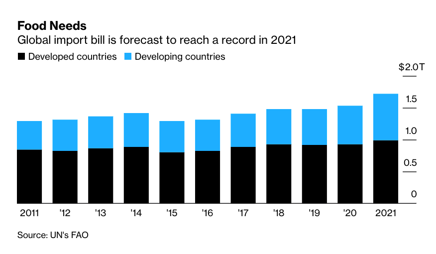
In a vast redistribution of income, hundreds of billions of dollars will be transferred from low-income and middle-income food importers to agricultural exporting countries. As the FAO reports, developing countries face a 21% jump in the total import bill for food, compared with a 6% increase for the richest ones.
It is a serious situation. And it can appear even more so, if one combines it with the other crisis du jour – the energy crisis.
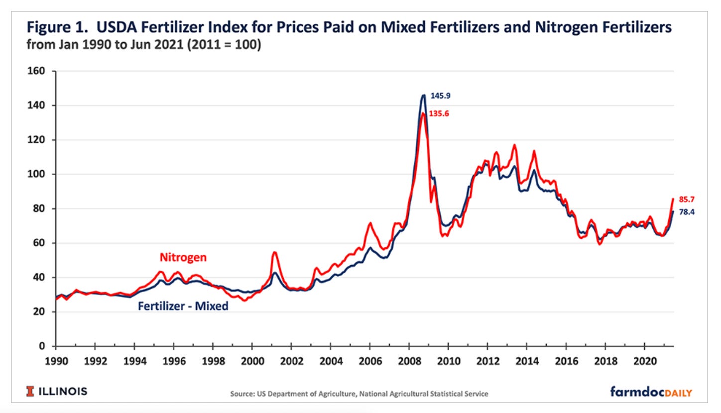
As the saying goes, modern agriculture is a mechanism for turning fossil fuels into food. Not just through mechanized farm machinery but, crucially, through artificial fertilizers. Natural gas is the feedstock for 95 percent of the production of ammonia, which in turn is the key ingredient for the production of nitrogen-based fertilizers. So, rising global gas prices, will feed into rising fertilizer prices, which will feed into higher farmgate prices for food.
As the Nobel Institute explains:
“Manufacturing 1 ton of anhydrous ammonia fertilizer requires 33,500 cubic feet of natural gas. This cost represents most of the costs associated with manufacturing anhydrous ammonia. When natural gas prices are $2.50 per thousand cubic feet, the natural gas used to manufacture 1 ton of anhydrous ammonia fertilizer costs $83.75. If the price rises to $7.00 per thousand cubic feet of natural gas, the cost of natural gas used in manufacturing that ton of anhydrous ammonia rises to $234.50, an increase to the manufacturer of $150.75.”
In Asia in October gas prices briefly touched a peak of in excess of $34 per thousand cubic feet. The price since then have eased, but the implications are clearly serious.
In Europe, the surge in gas prices has been most extreme in the UK. Ten small firms supplying almost 2 million households have failed, leaving open the question of continuity of supply. Brexit-induced supply chain difficulties and the absence of East European harvest labour have meant that supermarket shelves have sometimes been empty. Taken together, the UK seems, to some observers at least, to be facing a new “winter of discontent”.
The UK is also the home base of a particularly influential financial newspaper, which may account for some of inflamed tone of the commentary on this coincidence of rising energy prices and nagging supply chain issues. At times, a famine like that in 1930s Ukraine, has not seemed far away. And the panic – cue handwaving – has something to do with climate activists, state interventionism and net zero.
This is a discursive knot that desperately needs untangling.
I want to focus here on the global food price issue.
The rise in global food prices is a HUGE deal that demands urgent attention at the UN level. It is crucial that the budgets of all relevant aid agencies be adequately funded so that food supplies can be maintained. Importing countries must have the foreign exchange they need.
The World Food Programme has sounded the alarm:
“High food prices are hunger’s new best friend. We already have conflict, climate and COVID-19 working together to push more people into hunger and misery. Now food prices have joined the deadly trio,” said WFP Chief Economist Arif Husain. “If you’re a family that already spends two thirds of your income on food, hikes in the price of food already spell trouble. Imagine what they mean if you’ve already lost part or all of your income because of COVID-19.”
…..
A record 270 million people are estimated to be acutely food insecure or at high risk in 2021 – a 74% jump from 2020, driven by conflict, economic shocks, natural disasters, the socio-economic fallout from COVID-19, and now food price hikes. In 2021, WFP is undertaking the biggest operation in its history, targeting 139 million people worldwide.
It is also true that there is more and more evidence to suggest that climate change is impacting global food supplies. To name just two examples, both the US and Brazil are suffering from serious drought.
It is more than likely that high energy prices will, in due course, feed through to farm gate prices, by way of fertilizer costs. But, it is very unlikely that energy is a major driver of the escalation of food prices we have seen so far. The timing is just not right. The escalation in key commodity prices began months before the surge in fertilizer prices began to make itself felt.
The serious implications are for prices in 2022 not in 2021.
Finally, it is altogether implausible to attribute any of these price increases, either those we have seen so far, or those that are likely to be in the pipeline, to climate policy. Climate change, yes. But climate policy, no.
Net zero may be a slogan to be heard everywhere, but, regrettably, it has had far too little real impact so far.
As for the analogies to the 1970s, if they serve a purpose in alerting the authorities to the need to take urgent action to avoid a food crisis, so be it. But in looking more closely at the data, I have run into some real puzzles.
I may be barking up the wrong tree with the following thoughts. So, take the above as read and let me put the following in a separate section, which comes with a health warning.
*********
The FAO food price index, which appears to show that in “real terms” food prices are now close to their 1970s levels, is a complicated beast.
Its make up is explained well in this useful FAO slide deck.
It is clearly a mistake to read this index as a food price index. It is not an index of what consumers actually pay. It is really a commodity price index. More relevant for producers than for consumers.
But, what is puzzling me, is the way it is adjusted to reflect relative price movements i.e. the way we move from a nominal food price index to a thing we call a “real price index”. This is the adjustment which generates the remarkable conclusion that food prices today are as high today as they were in the crisis period of the early 1970s.
My worry about this claim, arises from the simultaneous publication of another report on the world food situation. This too was authored by the FAO. But this one is published in collaboration with the OECD.
The OECD-FAO report also contains a table on the long-run development of real food prices. And it this graph which is causing me the headaches. It shows the 1970s price spike. It shows the 2008 and 2011 spikes, but the current spike is really not showing up.
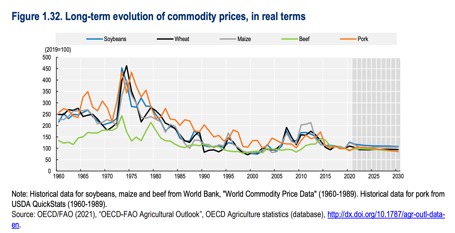
Rather than a composite index, the OECD-FAO graph shows the price of soybeans, wheat, maize, beef and pork separately. Together they make up a substantial part of the FAO food price index and according to the OECD-FAO calculations, in real terms they are up slightly relative to 2020, but they remain very far below their 1970s peaks.
To reiterate, these are separate price series for particular commodities. But these are very important commodities. Given their weight in the FAO food index, it is hard to see statistically how one can reconcile the two charts. Indeed, it is hard to see economically how it could be true that if the real prices of these commodities are this low, the prices for other commodities in the FAOs index could be at 1970s levels in real terms. For traders there would be gigantic opportunities for arbitrage between crops. And why would any farmer continue to produce wheat if all wheat commands are the kind of prices being shown in the OECD-FAO numbers, whilst other commodities are commanding the kind of staggering prices implied by the FAO food price series.
There is something wrong here. The discrepancy is huge and it is not recent. What is going on? I cannot be the first person to notice this. I must be missing something!
My first thought was that the problem is not in the commodity prices, but in the price for other goods to which they are being compared. The widely quoted FAO Food Price is deflated by the Manufactures Unit Value Index of the World Bank, whereas the OECD-FAO table uses the US GDP deflator. As the OECD-FAO report notes, that may create a different.
For a description of the index and its components please refer to the special features on the FFPI in (FAO, 2013[37]) and (FAO, 2020[36]). The Outlook uses the US GDP deflator (2014-2016=1) to obtain the index in real terms. As a result, the real FFPI in the Outlook is different from what is published in (FAO, 2020
Reading that footnote came as a relief. The OECD-FAO analysts see the discrepancy too and attribute it to the deflator. That was the hypothesis that Cameron Abadi and I discussed on Ones and Toozes.
It is an intuitively plausible idea. If the World Bank price index used by the FAO to do the deflation is measuring “Manufactures Unit Value” it might well exhibit a strong downward tendency. After all, we have become very, very efficient at making manufactured goods. It would not be implausible to suggest that a bushel of wheat buys you far more computer or cellphone in 2021 than it did in 1973. That is what it means to say that the real price is as high now as it was in the early 1970s.
To be make sure, I thought I would email the official at the FAO responsible for the index. They responded, pointing out that the FAO index has far more components that the few commodities listed by the OECD-FAO, but broadly agreeing with my hunch that the action was probably in the deflators i.e. the prices series to which the food prices were compared.
But could the discrepancy really be large enough? I decided I really ought to check the underlying price indices themselves. Did the World Bank’s Manufactures Unit Value index (used by the FAO to produce the headline about the 1970s) diverge as strongly from the US GDP deflator (used in the far less dramatic OECD-FAO) numbers as I supposed? To offer a satisfactory explanation, the MUV would need to plunges below the GDP deflator.
So, it was a bit of a shock to discover this.
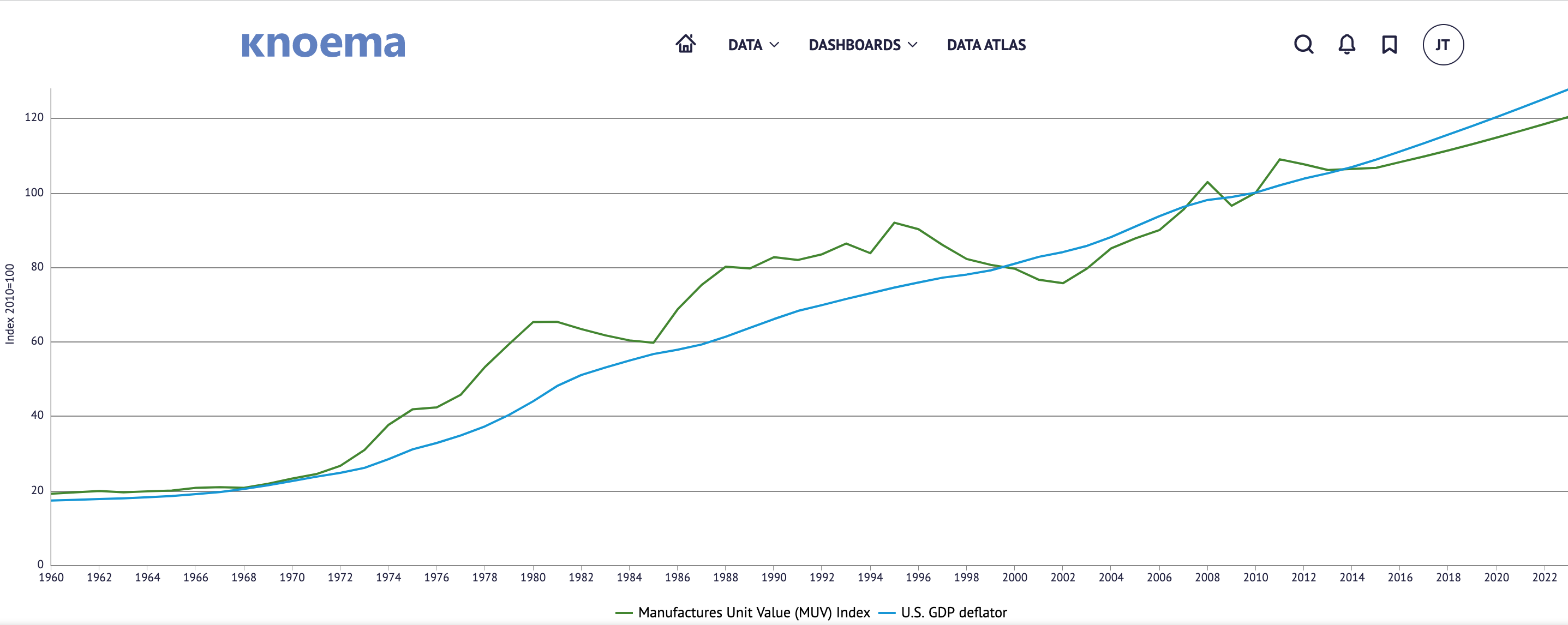
The two deflators really don’t diverge at all.
Admittedly, the World Bank MUV index is rather obscure. I may have got hold of the wrong index. But this is the kind of thing that makes you go … hmmmm.
I’m a bit stumped. I’ve fired off more emails to the person at the FAO. Maybe they can help.
Right now, amidst all the talk of stagflation and energy crisis, I’m worried that we have the story about food wrong too. Not only is the link to energy being seriously overplayed and for bad reasons. But the idea that we are back to 1970s in real terms, may be quite misleading. I hope I may simply be misreading the numbers somehow. If anyone can resolve the puzzle I would be very grateful.
Watch this space ….
I love putting together this newsletter and I love the fact that it goes out free to many readers. If you are enjoying the read and can afford to support the project, please consider signing up for one of the three subscription options.
- The annual subscription: $50 annually
- The standard monthly subscription: $5 monthly – which gives you a bit more flexibility.
- Founders club:$ 120 annually, or another amount at your discretion – for those who really love Chartbook Newsletter, or read it in a professional setting in which you regularly pay for subscriptions, please consider signing up for the Founders Club.